A conversion problem becomes easier to investigate when you describe the task a person was trying to complete. “Improve the landing page” leaves too much open. “Help a suitable customer understand the offer and submit an enquiry” gives the team something to observe and test.
Start there. Then ask where the evidence suggests the task is failing and what additional check would distinguish the likely explanations.
This approach is useful for small businesses as well as larger teams. It does not require turning every change into an A/B test. It requires being clear about the question each kind of evidence can answer.
1. Define a useful conversion
A button click, accepted form submission and qualified enquiry are different events. If the business cares about the last one, optimizing only the first can create a misleading success story.
Write down the steps from intention to useful outcome. For an enquiry flow, that might mean opening the form, entering valid information, receiving confirmation, delivering the message and determining whether the enquiry fits the service.
Confirm that the measurement corresponds to those steps. A success event that fires before the server accepts a submission cannot establish successful delivery. A test submission can verify function without representing a real customer conversion.
Keep commercial constraints visible. If the offer is unavailable in a visitor's area, more completed forms may increase work without helping either side.
2. Use behavior signals to choose where to look
Heatmaps and recordings can identify places worth investigating. Microsoft Clarity defines rage clicks as rapid clustered clicks. Its semantic metric documentation describes observable behavior, not a reliable explanation of what the person wanted.
A repeated click can mean an unresponsive button. It can also be expected behavior in a map or another interactive element. A visitor leaving a page may have found the answer, rejected the offer, been interrupted, or encountered a failure.
Choose a relevant segment and inspect the task. Compare the suspicious behavior with successful journeys. Reproduce the interaction under the affected conditions before prescribing a repair.
Treat private recordings carefully. Evidence can be useful without distributing a customer's session or personal information in a report.
3. Combine different kinds of evidence
CXL's conversion research guidance makes the point directly: “we need better data.” Its ResearchXL framework brings multiple research methods together to generate hypotheses.
For a small team, the practical version can be simple. Use analytics to locate the affected step. Inspect the actual page and device behavior. Watch relevant task attempts. Ask suitable users what they understand and what they need to decide.
Each method adds something different. Funnel data can locate an unusual drop. A task test can reveal confusing language. A customer conversation can expose a commercial constraint the interface cannot solve.
Do not count agreement between several reports as independent confirmation when they all depend on the same broken tracking event. Check how the evidence was produced.
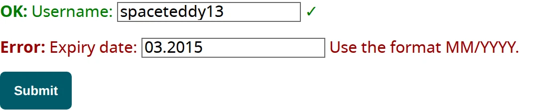
W3C WAI · © 2026 World Wide Web Consortium · Permissive license
4. Reproduce the obstacle before redesigning around it
Demonstration: a fictional service business receives fewer mobile enquiries. Recordings show repeated clicks near submit. A task test reveals that a telephone-format error appears above the visible area while the form clears the visitor's message.
The proposed repair can now be specific: retain valid input, identify the affected field, explain the required format, and help the visitor reach the error. The team can verify those behaviors directly.
W3C's form notification guidance explains useful field-specific feedback and correction. It supports the repair approach. It does not promise a particular increase in enquiries.
After the repair, test the complete journey again, including confirmation and delivery. Then observe suitable real submissions. “The error is now recoverable” and “the business received more qualified enquiries” remain different conclusions.
5. Borrow research carefully
Published usability research can suggest likely problems, especially when a team has limited access to participants. It should help choose checks rather than replace knowledge of the actual audience.
Baymard's cart-abandonment research includes reasons such as browsing and commercial constraints. Its aggregate abandonment figure is not a target every shop must beat, and not every abandonment represents a broken interface.
Its accessible checkout guidance can inform a store's investigation. Applying ecommerce findings to a professional-service enquiry page requires another judgment about relevance. A checkout account requirement and a consultation eligibility question do not necessarily create the same tradeoff.
Write the applicability into the recommendation: which research insight is relevant, what local evidence supports it, and what could make it wrong here?
6. Choose the right way to learn
If a form is demonstrably broken, repair and verify it. Waiting for enough traffic to prove that a broken form is undesirable wastes time.
If the question is whether people understand a new offer, conduct task-based research with suitable participants. NN/G's small-study guidance concerns qualitative usability learning. A handful of participants can reveal problems; it does not establish the percentage by which a redesign will increase conversion.
If the question is whether one working variant performs better than another, a properly designed experiment may be appropriate. Define the outcome, eligible population, assignment, sample requirements, guardrails and stopping approach before launch.
Low traffic can make a modest conversion difference difficult to estimate. In that case, report the decision supported by research and the outcome that remains uncertain. A confident but unsupported winner is less useful than an honest limitation.
7. Make the hypothesis and follow-up reviewable
A useful hypothesis names the audience, observed obstacle, proposed change and expected behavior. For example: “Visitors using this mobile form lose their message after a validation error; retaining it should make recovery easier.”
Attach the evidence and verification steps. Record who can approve the change, who will implement it, and what else changes at the same time. Track lead quality or another appropriate guardrail so a superficial improvement does not hide a worse business result.
Use website prioritization to choose among competing tasks, and outcome measurement to plan the review. Conversion work becomes more valuable when the team can explain both the action it took and the limits of what it learned.
Source references
Accessed 10 November 2026. Citations support the adjacent claims; they do not validate an individual site diagnosis or imply endorsement of SignalDesk.
- Conversion Research to Identify Better A/B TestsCXL
- Semantic metricsMicrosoft
- Cart Abandonment Rate: 50 Statistics & Why People AbandonBaymard Institute
- Ecommerce Checkout UX GuideBaymard Institute
- How Many Test Users in a Usability Study?Nielsen Norman Group
- User notifications in formsW3C WAI
Make the decision reviewable.
See an example with its observation, next action, six checks and follow-up kept together.
Read the example